Dashboard delivery
A few months ago, I was asked by Te Pou to review feedback surveys on a Skills Matter training programme that supports nurses working in mental health and addiction. Te Pou were keen to see what outcomes had been reported through the course, called New Entry to Specialist Practice: Mental Health and Addiction Nursing.
I was immediately struck by just how much data they had, and also what a strong story there was to tell about the impact of the course across many strategic areas.
For this piece of work, I wanted to do more than a detailed report across every domain; I wanted something that could nutshell how the courses were contributing to their intended outcomes. Dashboards are great of ways of bringing together disparate data in a structured way to convey progress and change.
Often dashboards will focus on multiple data sources, but in this case there was just the survey data to report on. Over time, the surveys have been adapted with new questions added, so for some indicators there wasn’t five years of data to draw on. But even so, there was still a good range of data that could be brought together to tell a reasonably comprehensive story.
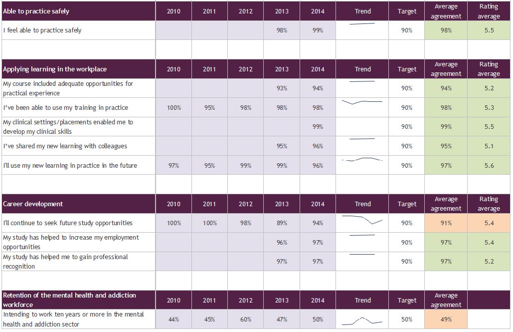
The image below shows how it all came together.
I constructed this in Excel, and used sparklines to show change over time. I was able to show change over time, average ratings and performance against target, with some traffic light colour coding to show performance relative to other indicators.
If you are interested in developing dashboards, Stephanie Evergreen has done some great blogging on dashboards, including this one. I'm also always happy to chat and to take feedback on this sort of work.
The full report to Te Pou is available here.


